Using Personas to Design a Website: A Real-world Example
by Kevin Godby
Another week, another post. I presented this material to the HCI 522 class this week.
A long time ago, in a galaxy far away, I was a technology coordinator for a small, rural K-12 school. I was tasked to organize six high school seniors to create a new school website.
Since the school’s website was to also serve as a community resource, our audience was very broad and ill-defined. We decided to use personas to help us design the website. The following is the process we used to design the website
Step 1: List the types of users
We first created a list of all of the types of users that we thought would visit our site. Our list included user types such as:
- elementary students,
- high school students,
- teachers,
- parents,
- grandparents, and
- school officials.
Step 2: Create a persona to represent each class of users
Next, the students and I wrote one persona for each class of users. A couple examples of our personas follow:
Sally is a 17-year-old senior who likes to hang out with her friends and chat online. She loves taking pictures for the yearbook and never misses a ball game.
Jim is Sally’s dad. He doesn’t trust Sally to drive his new truck to all those ball games she insists on going to, so he drops her off and picks her up at the school for each game. Being a single parent, Jim is also in charge of cooking the meals at home.
The personas that we actually wrote were two or three paragraphs long.
Hidden step
A “hidden step” that I failed to include in the slides is that after writing the personas, we discussed them and fleshed them out a bit. We explored the various goals and values that each of the characters possessed. This lead us into the next step.
Step 3: What features does each character want?
After exploring the goals and values of each character, we were able to tease out the specific website features that would benefit each of them.
Sally goes to the website to find out when that book report is due. She also wants to see the pictures from last night’s game. Oh, and if they’re serving mystery meat tomorrow for lunch, she’s bringing her own.
Jim has to schedule his time off work around Sally’s ball games and visits the website to check the schedule for the upcoming week. Sally harps at him if he ï¬xes the same thing for dinner as she had for lunch, so he checks the day’s lunch menu as well.
Step 4: Tally up the features
Next, we tallied up the number of personas that wanted each feature. This helped us determine which features were most important and which features would be least utilized.
| Feature | Number of Personas |
|---|---|
| lunch menu | 5 |
| upcoming events | 5 |
| photo gallery | 4 |
| homework assignments | 2 |
| games | 1 |
| board minutes and policies | 3 |
| job listings | 2 |
| recent events (newsletter) | 3 |
Step 5: Design the website
We used a few guidelines in designing the website, for example:
- Place the most common features on the front page of the site where they are easily found.
- Consider accessibility:
- The typeface should be large enough (or resizable) so that the grandparents can read the site
- Since broadband wasn’t available in this area, the site needs to be a small download. Don’t use large images or Flash or require other multimedia extensions/plugins.
The Result
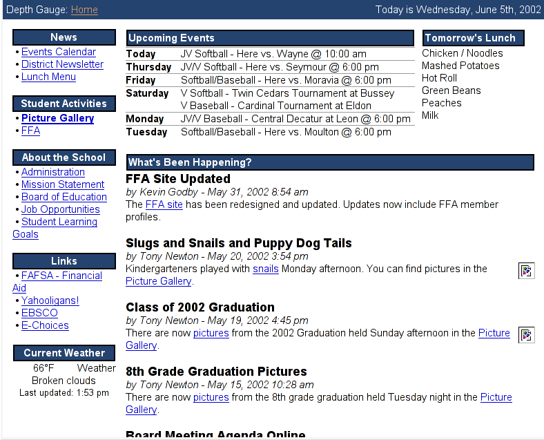
Since most of our personas were interested in the lunch menu, upcoming events, and recent events, we placed those items on the main page of the site. Most of the other features can be found be following the links in the navigation sidebar.
Overall, most people liked the site. There were some features that we didn’t predict, however. One example was that people wanted to check the website to see if school was delayed or canceled do to inclement weather. So on the days that school was delayed or canceled, we added a new red alert box above the upcoming events and lunch menu blocks that alerted the visitor.
References and Resources
- Kevin’s presentation slides (PDF)
- Kevin’s presentation video (Quicktime movie)
- OK/Cancel Jack and Jill comic
